.svg)

Fever Energy
.svg)

Overview
.jpg)
Challenge
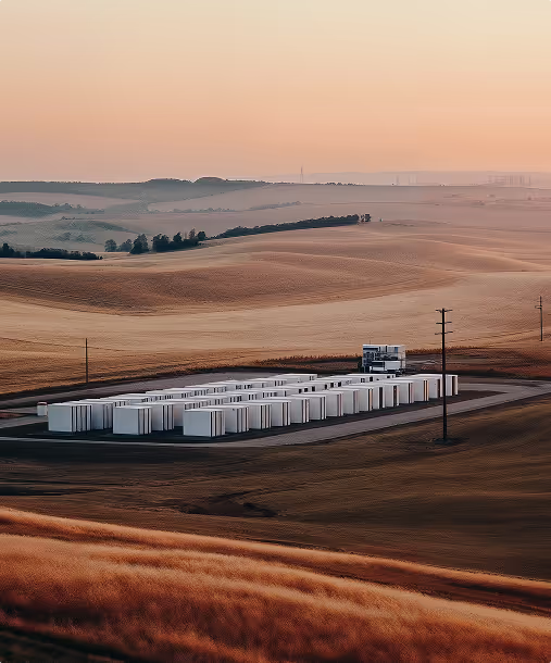
One of the main challenges was how to present a highly technical energy platform focused on distributed energy resources in a way that felt approachable to a wide range of audiences, from energy industry professionals to community decision-makers.
The client needed the website to clearly explain how their technology works while avoiding overwhelming visitors with jargon or overly complex diagrams.
Additionally, because the platform serves multiple user types such as solar providers, battery operators, and EV charging networks, the navigation and content structure had to be intuitive, allowing each audience to quickly find relevant information.
The marketing team also required that the site support lead generation, with strategically placed CTAs that guide visitors toward booking a demo or requesting integration details.
Solution
From the start, we knew the design needed to balance innovation with clarity. We used clean layouts, modern typography, and a minimal color palette inspired by energy and technology to communicate both trust and forward-thinking vision.
We worked closely with the client to simplify technical explanations into concise, benefit-driven statements supported by clear visual diagrams.
The navigation was structured to serve multiple audience types without clutter, and CTAs were placed at key decision points across the site to drive conversions.
By blending technical accuracy with an inviting user experience, the new website positions Fever Energy as both an industry innovator and a trusted partner for anyone looking to unlock the potential of distributed energy.
Typeface


Color Palette


.png)
Caribbean golden passport
.jpg)
.svg)
.svg)