.svg)


Kitspace
.svg)
Overview

Challenge
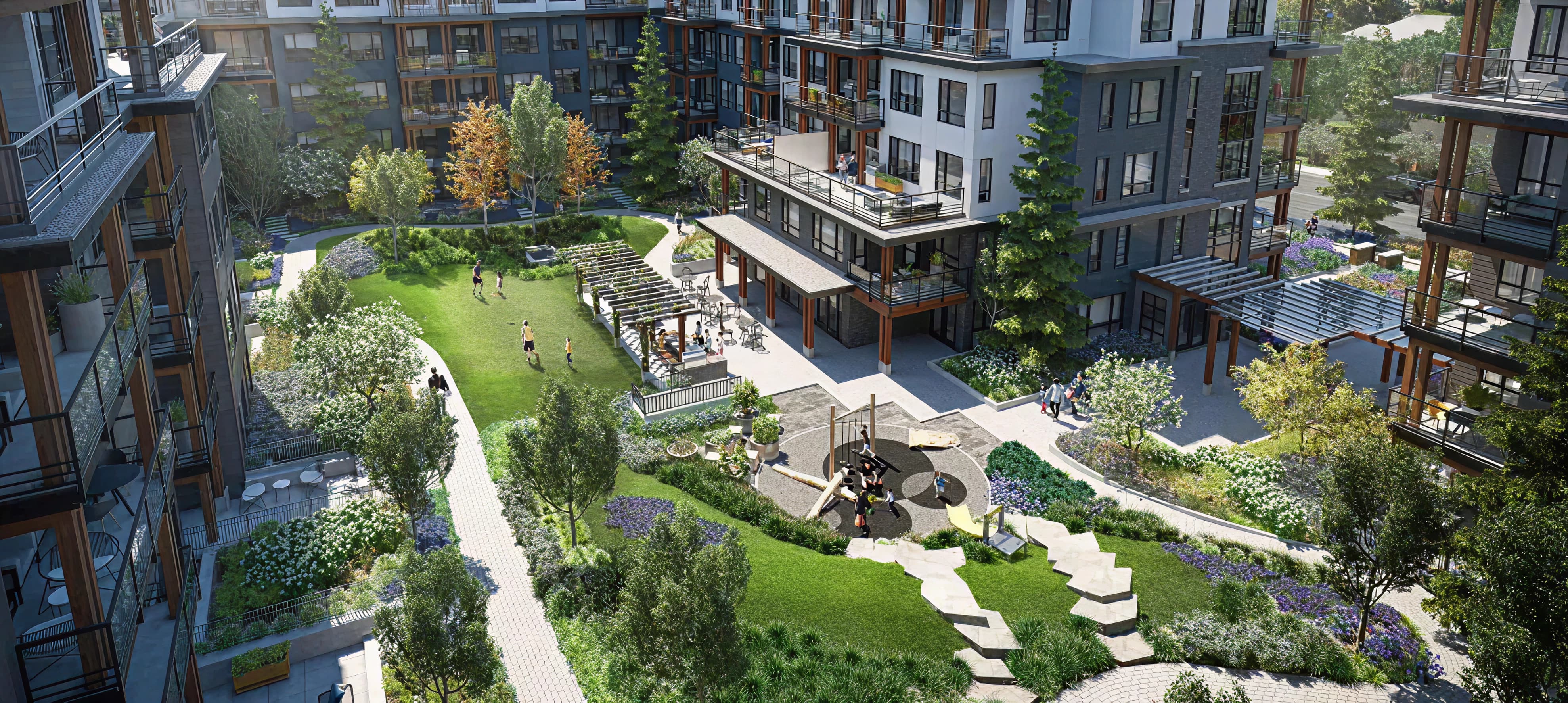
One of the key challenges was how to showcase the large number of completed projects Kitspace had delivered without overwhelming visitors or making the site feel cluttered.
The client wanted each project to reflect the quality, versatility, and craftsmanship of their modular interior solutions, while still maintaining a clean and professional look.
Additionally, the site needed to communicate Kitspace’s process and value proposition clearly to different audiences - from architects and designers to construction managers and property developers.
Solution
We designed a modern, visually balanced layout that organizes projects into an easy-to-browse portfolio with high-quality imagery and concise descriptions.
We used a modular grid system that mirrors Kitspace’s own approach to interiors, creating a strong visual connection between their product and the website experience.
Clear typography, generous white space, and a consistent color palette help keep the focus on the work, while strategically placed calls-to-action guide visitors toward learning more about the process or starting a project.
The result is a website that feels both inspiring and easy to navigate, allowing Kitspace to present their extensive body of work with clarity and impact.
Typeface

Color Palette


.jpg)
Baseline Vision
.jpg)
.svg)
.svg)